Getting Started
Welcome! This guide will teach you the digital skills and design principles that you will need to create a presentation poster in Adobe Illustrator. Before you create the poster, you will need to consider a few things such as size, how it will be displayed, printing specifications, and so on. Asking yourself these questions can help make the poster making process go more smoothly.
Topic
Obviously one of the first and easiest things to do is identify the topic or subject of your poster. Be sure to narrow your subject to something that can be easily illustrated or explained within a poster. If your topic is too broad, you may have too much information that can be realistically placed on a single poster. If you need help narrowing down a topic, use the Ask a Librarian service or try out our Search Strategy Generator.
Title
Once you know your topic, you may want to start early on thinking of a title for your poster. It is important to create a title that is appropriate and accurately describes your poster, but is not too wordy or long.
Target Audience
To identify a target audience, you will first need to identify who will see, benefit, or find interested in your poster's content. You can identify these people or groups in many ways, such as by age, gender, location, experience, education, and etcetera. Knowing your audience will help you create poster content that is appropriate for them. For example, a poster containing high-level terminology may need to contain definitions of terms if presented to a general audience, but could be appropriate without definitions at an academic research conference. Break down the demographics of your audience - their experiences, education, background, etc. - and continually ask yourself "is this appropriate for my audience?".
End Use
Once you have finished your poster, what will you do with it? Will it be mounted and displayed at a conference or will it be a digital PDF hosted online? Knowing where and how your poster will be displayed/used will help you determine the specs of your poster. If it will be displayed at a conference, what is the maximum and minimum sizes the poster can be? How high will it be hung? Where will it be viewed? These things will matter when it comes to designing your poster and if you don't know your specs, figure them out now!
Learning Goals
You are most likely creating a poster so that you can explain to showcase some new ideas or research to an audience. What are some of the things your audience should learn? It's good to identify several key learning goals and rank them in order of importance. This will help you determine hierarchy in your content and ensure that you have clear and understandable learning goals.
Due Date/Timeline
This is actually a two-part question - when is the poster due and how much time do you have to create it? If you've never created a poster before, then you may not be aware of how much time it may take. You may find yourself running out of time and end up with less than desirable results. We recommend drawing a simple timeline with small goals or checkpoints to keep yourself on track.
Printing and/or Hosting
You've already determined your end use, so you should know by now if you will be needing to print, digitally display, or do both for your poster. If you are printing, then you need to shop around for print shops or services on campus or in the the Ann Arbor area who can print a poster at the size you need. You may need consider travel and whether you need a poster tube or case as well. Making these arrangements ahead of time can save you from the last-minute stress of trying to print right before a deadline. A list of on-campus printing venues is in the Saving, Printing, and Exporting section.
If you need to host your poster online or if it will be displayed from a project or on digital screens then your needs will differ. You will need to consider where the poster will be hosted, if this in on a personal website or blog, on university servers, or through your organization's website.
Tips for Designing a Poster
Your poster should be a good balance of text, images, charts, and white space. Keep the following basic design principles in mind when planning and creating your poster.
Composition
The composition is the layout of your poster. It refers to how the objects are placed and arranged on the poster. One major goal of composition is balancing out your content. If you have images all to one side with a lot of text on the other, the design might feel a bit lopsided. Here are some guidelines to creating a good composition.
- Always be thinking about hierarchy! It’s important the viewer of your poster knows where to look to navigate your information. For example, make headers stand out by making them large, have them use a different typeface, put a color block behind them, etc.
- Guide the reader's eye. Follow "reading gravity" --the natural tendency of English readers to read from top to bottom and left to right--to organize your poster. Using headings and organizational cues helps readers know where to look next.
- Use the headings to give readers a quick impression of your presentation. Make the strongest statement your research allows to catch their eyes.
- Consider negative and white space in your poster and how it can be utilized. Use margins around your design to ensure that your content is not to the edge of the poster.
- Find balance. Look at your poster and see if it looks/feels balanced. Are there “heavy” elements such as images, dark colors, or large typefaces that are making one part of the poster feel more lopsided? If so, move them around until they balance with the rest of your content.

Text
It can be hard to determine how to organize your text, and what typefaces, aka fonts, to use for your design. There are some basic guidelines you can follow to help you navigate placing text. Your goal is to make your poster readable with clear hierarchy. Consider one of the following guidelines to help you set your type.
- Try not to use more than 3 fonts for you design or else it can look busy.
- Consider using a single typeface that has a family (bold, italic, condensed, etc.) and use the variations of that typeface to create hierarchy and contrast.
- Research typefaces pairings by searching for “good font pairings” to find some examples of typefaces that go well together.
- The following font size suggestions are general recommendations -- start with these sizes and see how they work for your content:
- Body text should be anywhere between 24 and 36 points. Double your body text size for any Headings.
- Your poster title should be around 100-120 points, with the attribution text running about 80-100.
- Pay attention to text size in figures - it must also be readable
- Be clear and to the point in your text. Having too much fluff in your paragraphs can lead to a visually crowded poster that is difficult to read, like the following example.
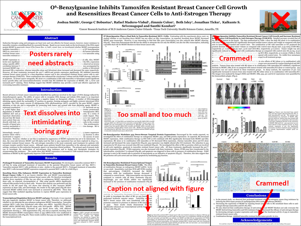
Poster example by Better Posters
Color
Be sure to use colors that do not clash and allow your text to be readable. You can use the WebAIM: Color Contrast Checker to ensure your colors will be accessible to all users. Additionally, selecting colors can be challenging, but there are color palette tools such as Coolors or Adobe Color to aid you.
The following is an example of a poster that uses color smartly to highlight the headings and frame the data in a clean way. Of course, there's still way too much text crammed in here.

dmahr flickr
Sample Posters
-
Poster PointersFrom PSI CHI, The International Honor Society in Psychology
-
Flickr Group Pimp My PosterA group that provides feedback on poster designs
Poster Design Resources
-
Better Posters: A Resource for Improving Poster PresentationsDiscussion and critique of academic poster design
-
Designing Conference Posters by Colin PurringtonLayout and design tips for creating dynamic research posters